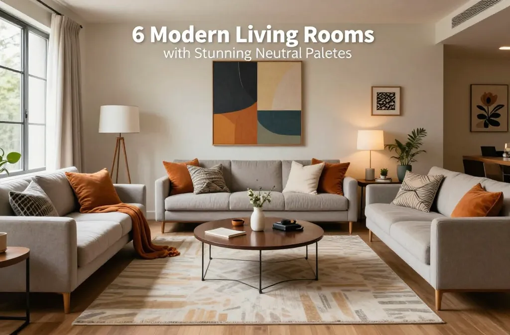
Neutrals don’t have to feel like oatmeal wallpaper. Done right, a neutral palette looks rich, layered, and quietly dramatic—the kind of room that whispers “calm down, you’re home now.” If you think beige equals boring, let’s change that. Here are six modern living rooms that keep things neutral and still deliver all the vibes.
Cream-on-Cream, But Make It Textured
Monochrome rooms can fall flat, but texture fixes everything. Picture a soft cream sofa with a boucle chair, a nubby wool rug, and linen drapes. You stay in one color family and let the materials do the talking.
How to build the look
- Start with a hero textile: A chunky rug sets the foundation and adds warmth fast.
- Layer tactile finishes: Boucle, linen, matte ceramics, and ribbed glass keep it interesting.
- Vary the sheen: Mix matte walls with a satin sideboard and a polished stone coffee table.
Pro styling tip
Keep your whites and creams within two shades. If your sofa leans warm, your rug should too. FYI, undertones run the show.
Greige + Graphite: The High-Contrast Neutral

Want drama without bold colors? Pair warm greige upholstery with dark charcoal accents. The combo feels modern and grounded—like a tailored suit, but comfier.
Why it works
- Warm meets cool: Greige softens the room while graphite adds structure.
- Natural anchors: A smoked oak coffee table or dark slate mantel gives the palette some muscle.
- Metal moments: Brushed black hardware and thin steel lamp bases create clean lines.
Styling formula
Try this: greige sofa + graphite armchairs + warm wood table + black-and-white art. Done. Seriously, it just works.
Soft Taupe with Earthy Accents
This is the “you’ll never get tired of it” living room. Taupe walls, stoneware lamps, and oak shelves create a soft, sun-baked vibe. Add clay, sand, and mushroom tones and you’ve got a palette you’ll keep for years.
Texture + tone checklist
- Walls: Velvety taupe or microcement-look paint for depth.
- Textiles: Sand-colored throws, mushroom velvet pillows, camel leather poufs.
- Accents: Terracotta planters, travertine trays, unglazed ceramics.
Lighting matters
Warm bulbs (2700K–3000K) make taupe sing. Cooler bulbs turn everything sad and gray, and IMO no one wants that.
Minimalist White, Elevated with Organic Shapes

White-on-white looks incredible when you add rounded, sculptural forms. Think a curved sofa, drum side tables, and a wavy-edged mirror. The shapes keep the room from feeling clinical and invite you to actually sit down.
Key moves
- Curves over corners: Softer silhouettes create motion and balance.
- Subtle pattern: Herringbone floors or a faint stripe in the rug add quiet interest.
- Natural materials: Plaster, limewash, and raw wood warm up crisp whites.
What to avoid
Too many shiny surfaces. Balance any glossy lacquer with matte plaster or raw stone so it doesn’t feel like a gallery you can’t touch.
Moody Neutrals: Cocoa, Espresso, and Stone
Dark neutrals = instant sophistication. Layer cocoa walls with espresso cabinets and cool stone accents. It’s cozy, a little mysterious, and very “I read on weeknights.”
Balance the depth
- Introduce light relief: Cream drapes and an off-white rug keep the room from feeling heavy.
- Play with scale: Large art or oversized floor lamps help the darker palette feel intentional, not cramped.
- Reflective moments: A bronze mirror or smoked glass adds glow without going blingy.
IMO must-haves
A velvety sofa and a stone-topped table. The combo looks luxe and handles real life.
Stone + Sand with Black Punctuation

If your room loves light, go airy with pale stone hues and sand upholstery. Then toss in sharp black lines—a picture light, a slim coffee table frame, maybe window mullions. The black acts like eyeliner for your room.
The 70/20/10 rule
- 70% light neutrals: Walls, big seating, or rugs.
- 20% mid-tones: Wood furniture, textured throws.
- 10% black: Lamps, frames, a slender side table for contrast.
Pattern play
Keep patterns subtle: micro-checks, woven stripes, small-scale geometrics. They read as texture from a distance but still add personality up close.
Materials That Make Neutrals Shine
You can nail the palette and still miss the magic if you skip the materials. The secret sauce? Contrast and character.
- Wood: White oak for airy warmth; walnut for depth and polish.
- Stone: Travertine and limestone bring organic movement without shouting.
- Metal: Brushed brass, blackened steel, and pewter keep things modern.
- Textiles: Linen, wool, bouclé, and cotton canvas age beautifully and feel luxe.
- Wall finishes: Limewash, Roman clay, or a soft eggshell paint add dimension.
Real-life durability
Got pets or kids or just a messy snack habit? Performance fabrics in light neutrals exist now (praise be). Look for crypton or stain-resistant finishes and removable cushion covers.
Styling Essentials for Neutral Living Rooms
Accessories can make or break the vibe. Keep it considered, not cluttered.
- Art: Black-and-white photography or abstract neutrals feel modern. Large scale = instant sophistication.
- Books: Stack coffee table books in tonal covers for subtle color and height.
- Greenery: Olive trees, eucalyptus, or a low-texture monstera add life without clashing.
- Throws + pillows: Mix sizes and textures; stick to 2–3 colors in the same family.
- Trays + bowls: Corrals remotes and feels intentional. Stone or wood looks best.
Lighting layer cheat sheet
- Ambient: A central pendant or flush mount sets the overall tone.
- Task: Floor lamps for reading zones, swing-arm sconces by the sofa.
- Accent: Picture lights, candles, or small table lamps for mood.
FAQ
How do I keep a neutral living room from feeling bland?
Layer textures like crazy. Mix smooth leather with nubby wool, matte walls with polished stone, and soft linen with boucle. Add subtle contrast through woods, metals, and a few black accents to sharpen the edges.
Can I mix warm and cool neutrals?
Yes, but do it intentionally. Let one dominate (say, warm taupe) and add cool touches (gray or stone) in smaller amounts. Tie them together with multitone materials like travertine or mixed-fiber rugs.
What wood tones pair best with neutral palettes?
White oak and walnut work with almost everything. Driftwood and ash feel coastal and airy; espresso reads formal and moody. Keep the number of wood tones to two or three to avoid visual chaos.
Do I need color at all?
Nope. Neutrals can handle a full room. But if you crave a little pop, add muted color in small doses—sage, rust, or indigo in pillows or art. It still reads neutral-adjacent.
What’s the best rug color for a neutral living room?
Aim for a shade darker than your sofa so it doesn’t disappear. Flecked or heathered rugs hide life’s little messes. Natural fiber blends (wool-jute, wool-viscose) add great texture underfoot.
Any quick updates on a budget?
Swap pillow covers, add a textured throw, and bring in a large neutral print or mirror. Change lamp shades to linen, and layer a smaller rug over a budget jute. IMO, lighting upgrades deliver the biggest glow-up for the least effort.
Conclusion
Neutral doesn’t mean no personality. With the right textures, materials, and a few strategic contrasts, your living room can feel calm, sophisticated, and seriously welcoming. Pick your palette, commit to the undertones, and layer like a pro. Your future self—and your eyeballs—will thank you.